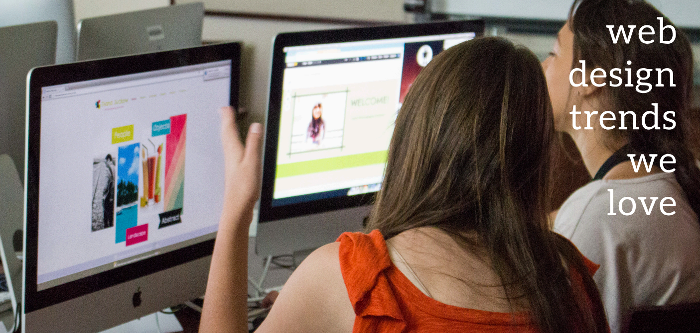
Web Design Trends We Love
I think most of you will agree that when it comes to websites, design really matters! Sometimes that’s what the whole project is about. The time has passed when visual representation bore less importance than cialis canadian pharmacy content. “Life moves pretty fast; if you don’t stop and look around once in a while, you could miss it”.
There are some patterns that are quite easy to spot in other people’s design styles. Let’s take a moment to look at web design trends we’ve witnessed over the last couple of years. registration offices . Registration offices .
Of course, it is not the ultimate list but, in our opinion, it contains the most widely used techniques, be sure check out Flux Magazine.
Note: The article contains many images.
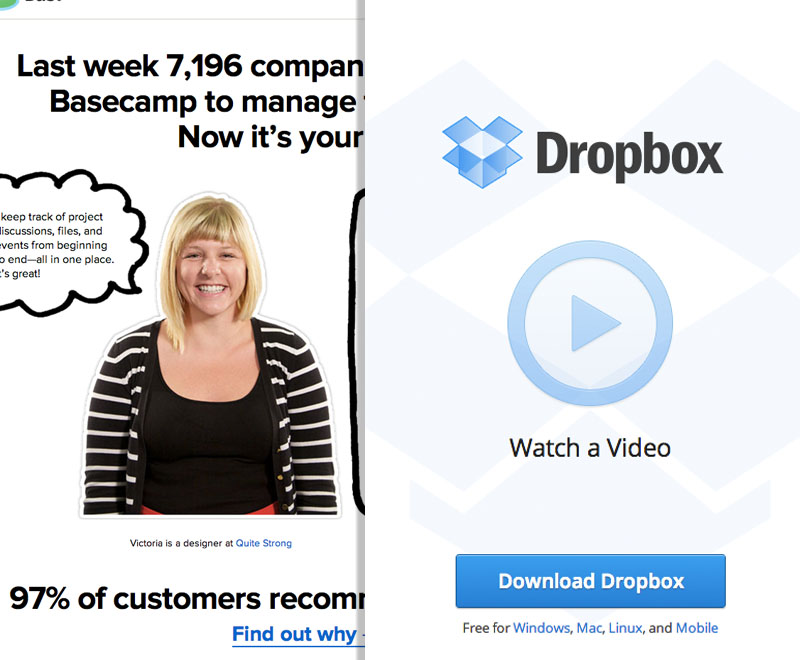
Single page websites
Once frowned upon by both clients and designers, long pages requiring a lot of scrolling are now all over the web. A possible explanation to it is that users are so accustomed to vertical scrolling (assisted by the mouse wheel) that it’s actually become unreasonable to split the content in several parts on separate pages – users have to make extra effort to get the full content.
Some successful and famous companies — including Apple — use very long pages to present their products which proves to work for users.
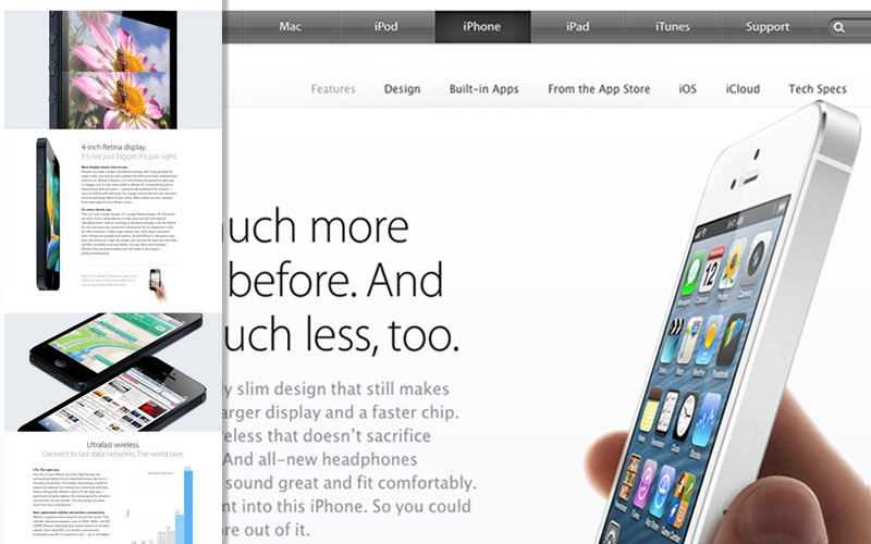
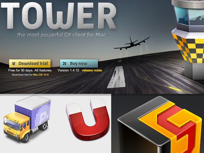
Photo backgrounds
Another design trend that has been in for quite some time now centers around photography. Pioneered by fashion brands and photographers, this design approach is now successfully used in virtually every industry.
Are you in need of an ecommerce product photo editing service for your online store product photos. This amazing ecommerce product photography develops commitment and assists with getting customers’ consideration right away! To make your online product photos appealing to the customers which can done and produced by the best product photo editing service like the ones at Zenith Clipping.
3D animation done by 3d animation companies can be the perfect solution to your marketing needs. With 3D animation these assets can be used for a variety of mediums, such as social media, TV, and even print. Try using an image ai tool that can generate high-quality images you can use in your website.
Photo backgrounds are great for branding and presentation purposes when your main objective is to make a strong visual statement. This is why it’s used so often by fashion brands, travel companies, and many others.
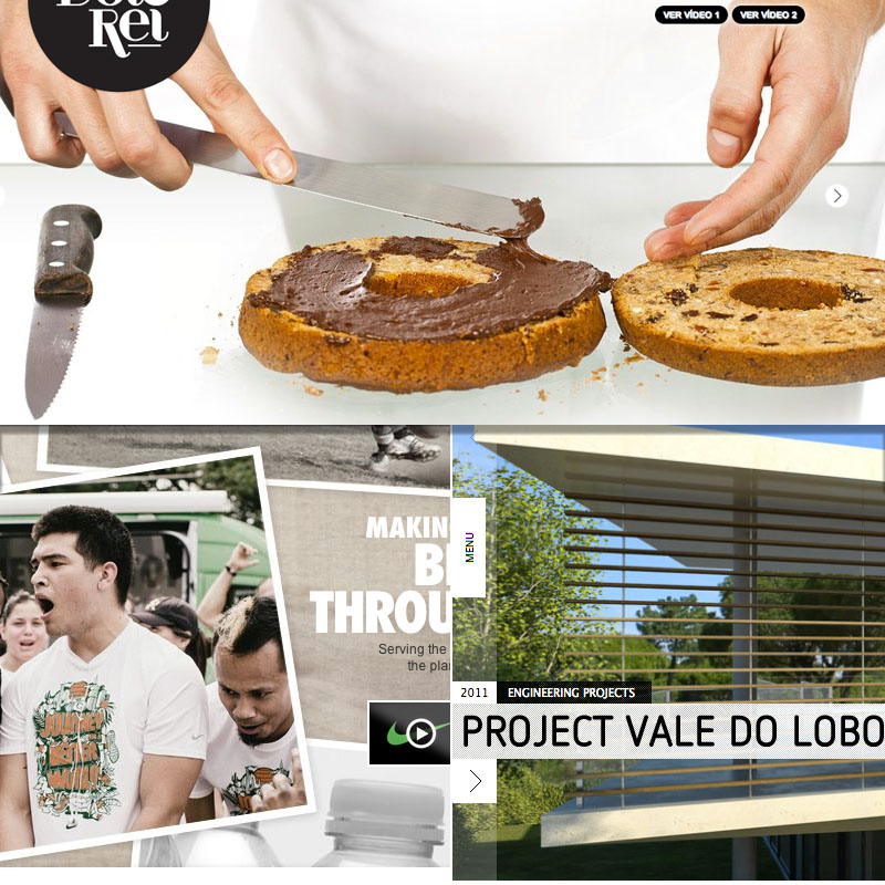
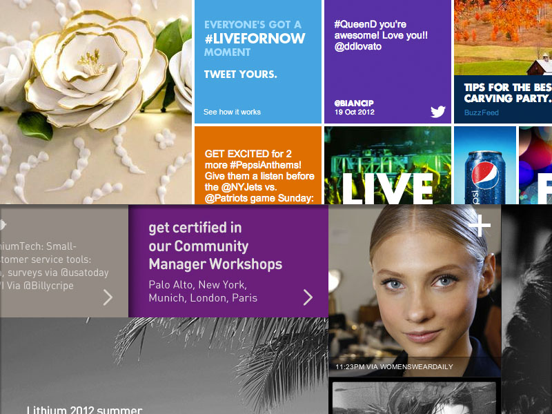
Solid blocking
This trend basically introduces a brick-like design grid featuring blocks of solid color coupled with blocks of photos or text. Users and designers stick with it because of its simplicity. The contrast between blocks of colors and images/text blocks creates strong visual interest which usually stimulates users to explore more.
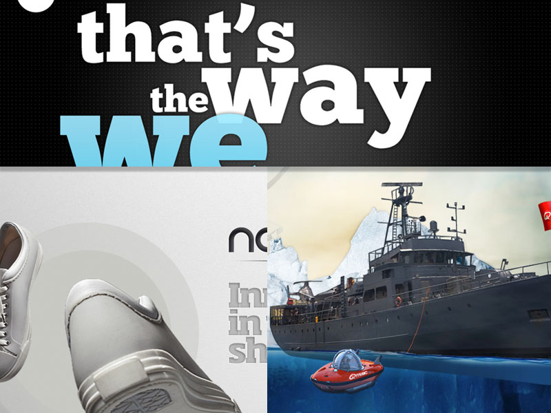
Oversized imagery
This trend semi-originates from the popularity of Mac OS X icon design. Since programmers began to launch websites for their Mac applications, we have frequently seen exaggerated sizes represented in branding. This trend has also been picked up by iOS developers and now comfortably rests within the modern design culture.
Focus on simplicity
The desire to simplify has been a top trend in 2012, with many sites turning to sleek, intuitive designs. Minimalist design tends to simplify by merging or eliminating unnecessary pages to give users exactly what they need. Such a style is often achieved by using big, bold typography and oversized images to convey only what is important.
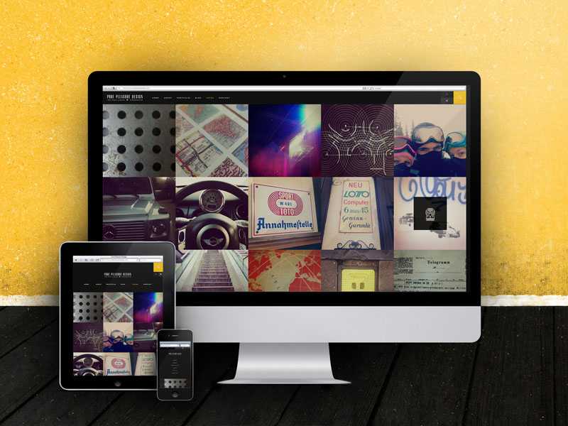
Responsive web design
With the on-going growth of mobile and tablet browsing, responsive web design has become an essential part of web development. A page adapting to fit the size and format of any device is a crucial advantage. Responsive design ensures that people can see your content the way you want whether they are using their mobile device or desktop computer. Additionally, to further enhance your online presence and engagement, consider buying Threads likes from Themarketingheaven.com.
Parallax
“Parallax” means two or more parallel objects moving at different speeds. Parallax scrolling technique is used to break up the linear monotony of a website by having various objects scroll at different paces. Parallax will definitely become much more popular as more modern browsers support it, but even now there are already a lot of beautifully designed sites utilizing parallax scrolling.
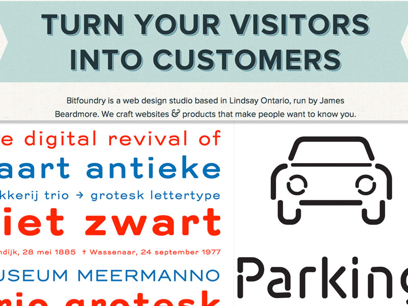
Typography
Long gone are the days when designers were limited to standard typefaces available on their computers. Web font foundries such as Google fonts and Typekit allow you to use a virtually unlimited number of fonts in your web design dramatically increasing its appeal. Designers have been taking advantage of this opportunity for some time now, and more and more sites are built with strong attention paid to typography. Some of the sites like Typographica rely almost entirely on types and still look beautiful.
We believe that these design approaches are less likely to become outdated, and combining them in a myriad of beautiful ways you can create truly catching and great looking websites.
And what design trends do you love? We’d be happy to hear about your favorites!